

By Robert Majdak Sr. MBA
Management Insights Group, LLC
August 19, 2026
Three Charting Methods That Expose Budget Variance
When a client asks whether the year went well, I never begin with the annual total. Aggregate figures constitute the most reliable concealment available in a financial statement. The illustrative company in this article finished at $18.79 million against an $18.6 million plan, a favorable variance of one percent that most boards would accept without discussion. That single number conceals two consecutive quarters of accelerating shortfall and a fourth quarter inflated by revenue that had merely slipped from the third. The diagnostic signal lives in the quarterly sequence, and the sequence must be interrogated visually. Below are the three charting methods I rely on when evaluating four quarters of actual results against an approved budget.
Method One: Clustered Columns with a Variance Overlay
This is the workhorse of quarterly financial reporting and the only one of the three methods I consider genuinely mandatory. Budget and actual occupy paired columns on a primary axis denominated in currency, while percentage variance rides above them as a line on a secondary axis. The construction reflects a deliberate analytical compromise. Absolute dollars establish materiality, because a six percent miss on a $4.8 million quarter is a fundamentally different conversation from six percent on $200,000. The percentage line normalizes across periods of differing scale, rendering the trajectory legible.
Read the line, not the columns. The columns confirm magnitude, whereas the line reveals directional momentum. In Figure 1 the variance line descends from positive 3.5 percent through negative 4.0 percent to negative 6.0 percent before reversing abruptly. That descent is the finding. Columns alone would have obscured it, because each successive quarterly budget escalates and the eye unconsciously compensates for the rising baseline.
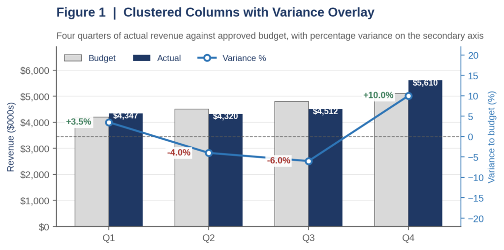
Figure 1. Paired budget and actual columns with percentage variance plotted on the secondary axis.
Method Two: The Variance Waterfall
The clustered column establishes that a variance exists and quantifies its magnitude, but it cannot establish causation. The waterfall, frequently called a bridge, decomposes the gap between budgeted and actual results into constituent drivers arranged sequentially from the budget anchor on the left to the realized result on the right. Each intermediate bar floats at the cumulative running total, with favorable contributions ascending and unfavorable contributions descending.
Its principal analytical virtue is that the presentation categorically forbids netting. Figure 2 bridges a favorable $510,000 fourth-quarter variance, and the composition proves considerably less flattering than the headline: $230,000 of the improvement is third-quarter revenue recognized belatedly, while discounting and customer churn jointly subtracted $325,000. Management reporting that terminates at the net figure would have missed both disclosures. I construct one rigorous waterfall for the most consequential quarter rather than four superficial ones.

Figure 2. Fourth-quarter bridge decomposing the favorable variance into its underlying drivers.
Method Three: The Bullet Chart
Stephen Few developed the bullet chart to replace the gauges and dials that clutter executive dashboards, and it remains the most information-dense variance display available. A horizontal bar encodes the actual result, a perpendicular marker encodes the budget target, and graduated background bands encode qualitative performance thresholds established before the period commenced.
Two specific design decisions determine whether the instrument functions as intended. First, index each quarter to its own budget so that one hundred invariably represents plan; the tolerance bands then align vertically and the periods become directly comparable. Second, calibrate those bands from documented policy rather than from observed results. Figure 3 applies a five percent tolerance typical of mid-market variance policy, which produces an instructive complication: the second quarter’s negative 4.0 percent falls within tolerance and would clear a single-period exception test, despite being the initial observation in a deteriorating sequence. This is precisely why the bullet chart supplements the clustered column rather than superseding it.
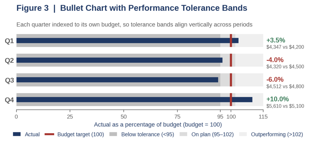
Figure 3. Each quarter indexed to its own budget, with policy-defined tolerance bands aligned vertically.
Indications of Over-Performance
Favorable variance is not automatically encouraging, and I subject unexplained outperformance to the same scrutiny as a shortfall. Durable over-performance exhibits three characteristics: it persists across consecutive quarters, it materializes in both volume and margin rather than exclusively in one, and it survives waterfall decomposition without depending on timing items.
The counterfeit version carries a distinctive signature. A solitary large favorable quarter immediately succeeding one or more unfavorable quarters ordinarily indicates pull-forward, meaning revenue displaced from the prior period rather than genuinely generated. The fourth quarter illustrated in Figure 1 represents the archetype. Equally suspect is revenue outperformance accompanied by disproportionate discounting, which signals that incremental volume was purchased with margin. Corroborate against cash conversion and receivable aging before declaring victory.
Indications of Under-Performance
The consequential warning is never the magnitude of an isolated miss but the persistence and direction of the sequence. Two consecutive unfavorable quarters exhibiting a widening gap, as in the second and third quarters here, constitute structural deterioration and warrant a forecast revision rather than an explanation. A comparable miss bracketed by on-plan quarters is ordinarily an execution or timing event.
Interrogate the sign convention with particular care. Favorable expense variance, meaning expenditure below plan, frequently reflects deferred maintenance, unfilled positions, or curtailed marketing rather than genuine efficiency, and it therefore borrows performance from subsequent periods. Read expense and revenue variance together: revenue below plan with expenses proportionally below plan indicates volume-driven contraction, whereas revenue below plan with expenses at plan indicates a margin problem demanding immediate structural intervention.
Selecting the Instrument
Deploy all three instruments, in deliberate sequence. The clustered column with variance overlay establishes what occurred and in which direction. The bullet chart establishes whether the result breached policy tolerance. The waterfall establishes underlying causation. Analysts who present only the first produce description; analysts who present all three produce a decision.
| Chart Method | Question It Answers | Principal Warning Signal |
| Clustered columns with variance overlay | What occurred, and in which direction? | A variance line descending across consecutive quarters |
| Variance waterfall | Why did the gap arise? | A favorable total dependent on timing or deferred items |
| Bullet chart | Did the result breach policy tolerance? | A result inside tolerance that still extends a negative sequence |
Exhibit A. Diagnostic reference for quarterly budget-to-actual variance review.
The discipline that matters most is establishing tolerance bands and materiality thresholds before the quarter closes. Thresholds constructed afterward are not analysis. They are narrative, and boards eventually recognize the difference.
-MIG
© Management Insights Group, LLC
Dallas/Fort Worth Texas Office